Maknet Marketplace
INDUSTRY: B2B Marketplace
DEVICE: Mobile app
APP STORE: https://shopmaknet.com/
DOWNLOADS: +1M
Maknet is one of the biggest B2B e-commerce platform in Thailand. The goal is to build the No.1 Thai platform for category-leading sellers to provide HoReCas, Retailers and Service SMEs with the right products and services. Maknet is build for helping the buyers, sellers and service providers in the communities to buy and sell products in stock.
ROLE: UX/UI Designer
TEAM: 3 designers, 2 POs, 1 PM, 6 developers
DURATION: 6 months
At Maknet, the goal was to design a mobile platform for iOS and Android users. As a UX/UI designer, I conducted user research by interviewing HORECA business owners and collaborated closely with developers to implement new features within a SCRUM framework. Through user testing, I gathered actionable feedback to drive iterative design improvements. Additionally, I maintained and updated the design system to ensure consistency and streamline the development process.
CHALLENGE
Building a cancellation, refund & returns process for products bought in stock.
Cancellation, return, and refund options are essential for any e-commerce platform, and Maknet was no exception. HORECA owners, who often place large orders, rely heavily on these features. Designing them required a deep understanding of logistical capabilities, technical constraints, and user needs to ensure a seamless and reliable experience.

THE PROCESS
Understand logistic limitations and users’ needs.
1.
Understanding requirements
Collaborating with key stakeholders to gather information about the desired features and their technical limitations, ensuring a seamless implementation
2.
Development
Generating initial design concepts and proposals based on the insights gathered during information-gathering sessions
3.
User testing
Planning and executing user testing sessions to validate or challenge design assumptions
4.
Finalizing
Refining the designs based on user feedback and creating design components for the design system
1. Understanding requirements
Cancellation, return, and refund features are critical for Maknet, as HORECA owners frequently place large orders and rely on these options. To design a seamless experience, I started by researching logistical constraints with experts from Maknet, including processes and timing, to understand what the system could realistically support. I then explored the refund workflow within available banking systems to ensure requests could be handled efficiently and reliably. Based on these insights, I designed user flows and interface elements that balanced operational feasibility.
2. Development
Leveraging insights from Maknet stakeholder feedback, we designed minimum viable products (MVPs) for the cancellation, return, and refund features. Using Figma, I created the designs and shared them with developers to evaluate the feasibility and capabilities of both backend and frontend implementation.
Design the Cancellation process
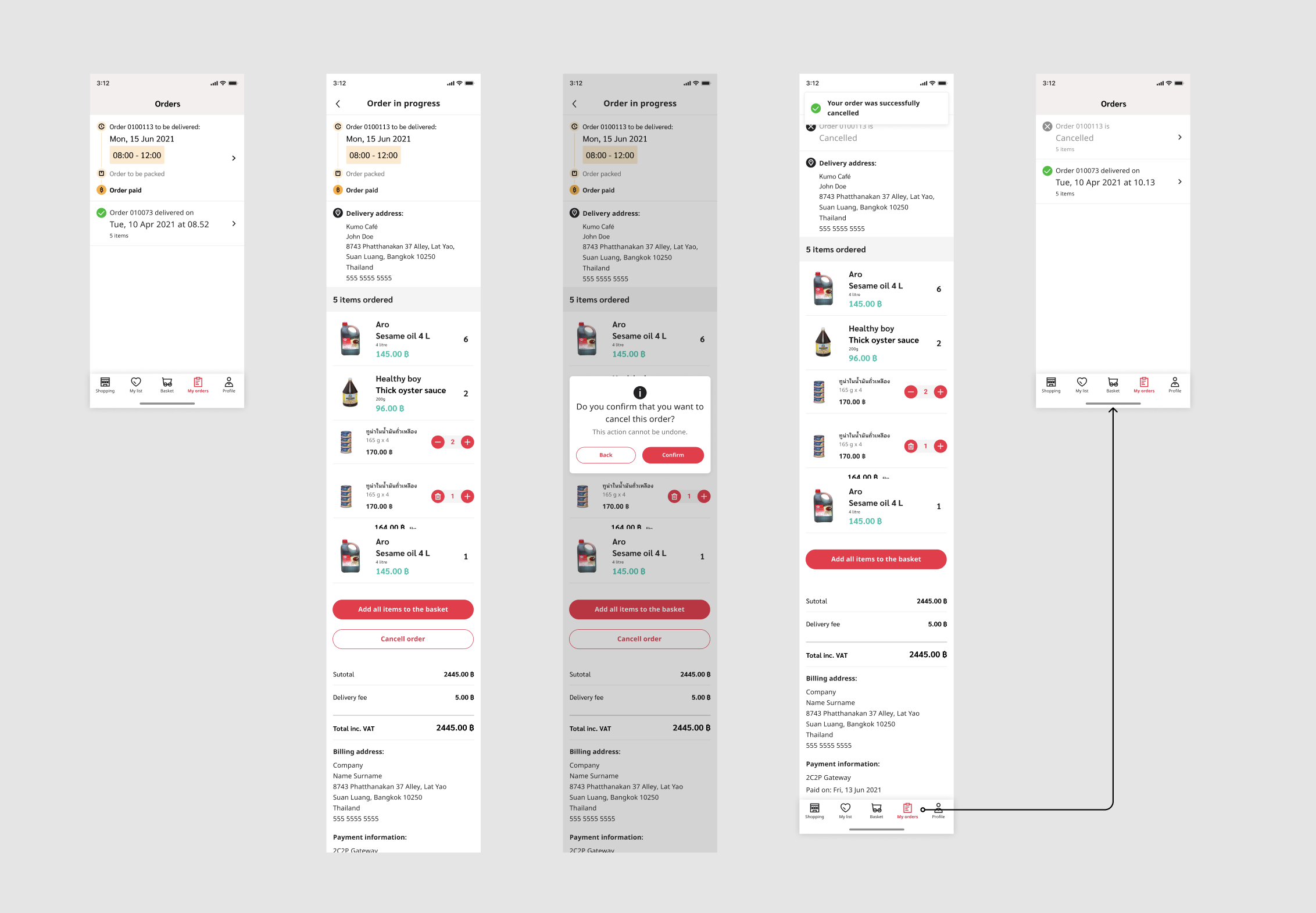
Below the cancellation flow of a user cancelling the order and then checking the order status.
1️⃣ Accessing Orders
Users begin by navigating to the Orders tab, where they can view active and past orders. Orders are clearly labeled with their status (e.g., “in progress,” “delivered”), helping users quickly identify the one they want to manage.
2️⃣ Order Details
When selecting an active order, users see all relevant details upfront: delivery slot, address, payment information, and a breakdown of items. This overview provides confidence that they are managing the correct order
3️⃣ Cancellation Option
A prominent “Cancel order” button is placed within the order detail screen. Before finalizing, users are prompted with a confirmation dialog that clearly states the action is irreversible. This step reduces accidental cancellations and adds a sense of safety.
4️⃣ Feedback and Confirmation
Once confirmed, the interface provides immediate feedback with a success message (“Your order was successfully cancelled”). The order status changes to “Cancelled”, ensuring transparency and reducing uncertainty.
5️⃣ Navigation Back to Orders
Users are seamlessly guided back to the Orders overview, where the updated status is visible. This closes the loop by giving users confirmation that their action was completed and recorded.
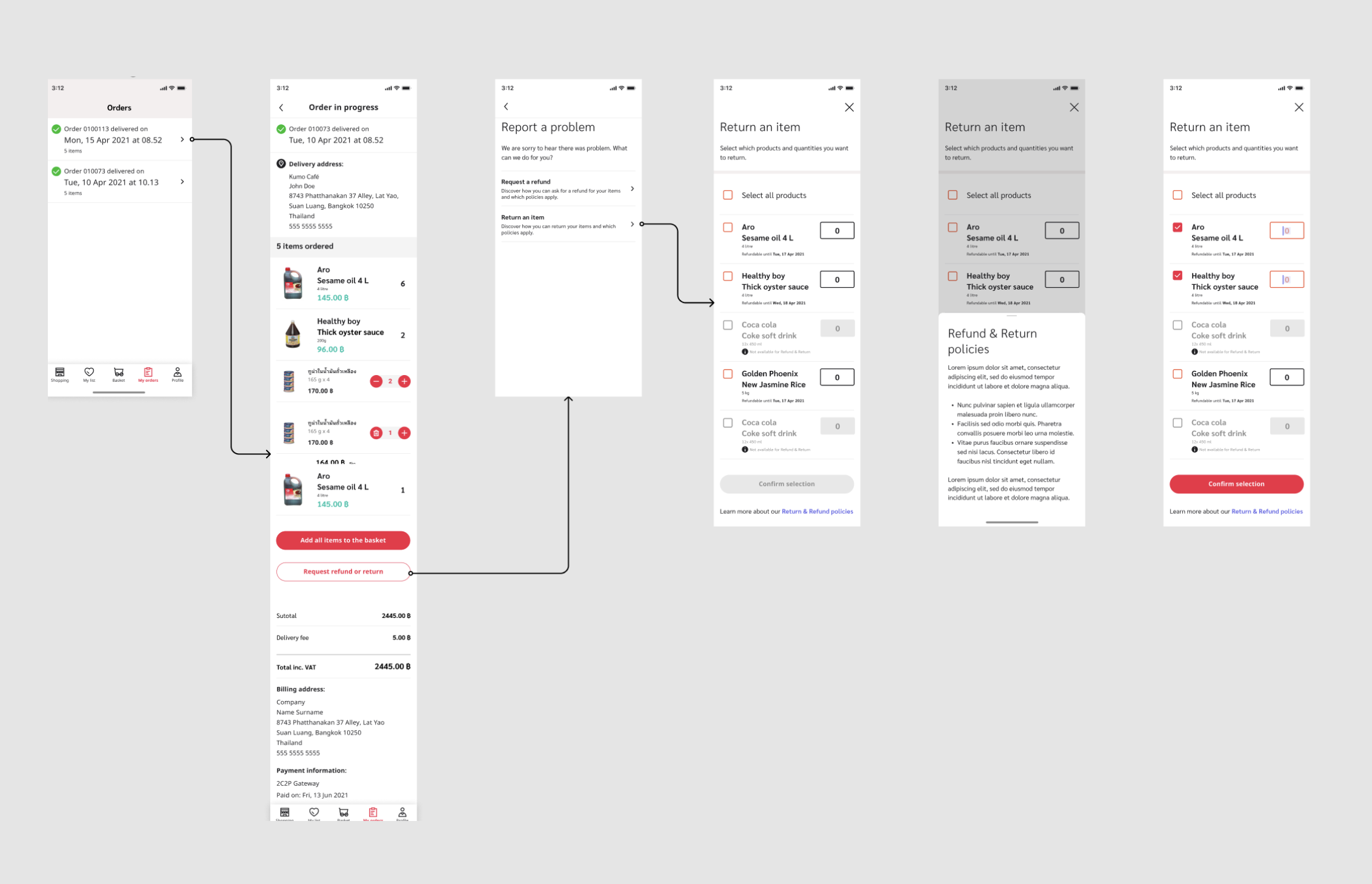
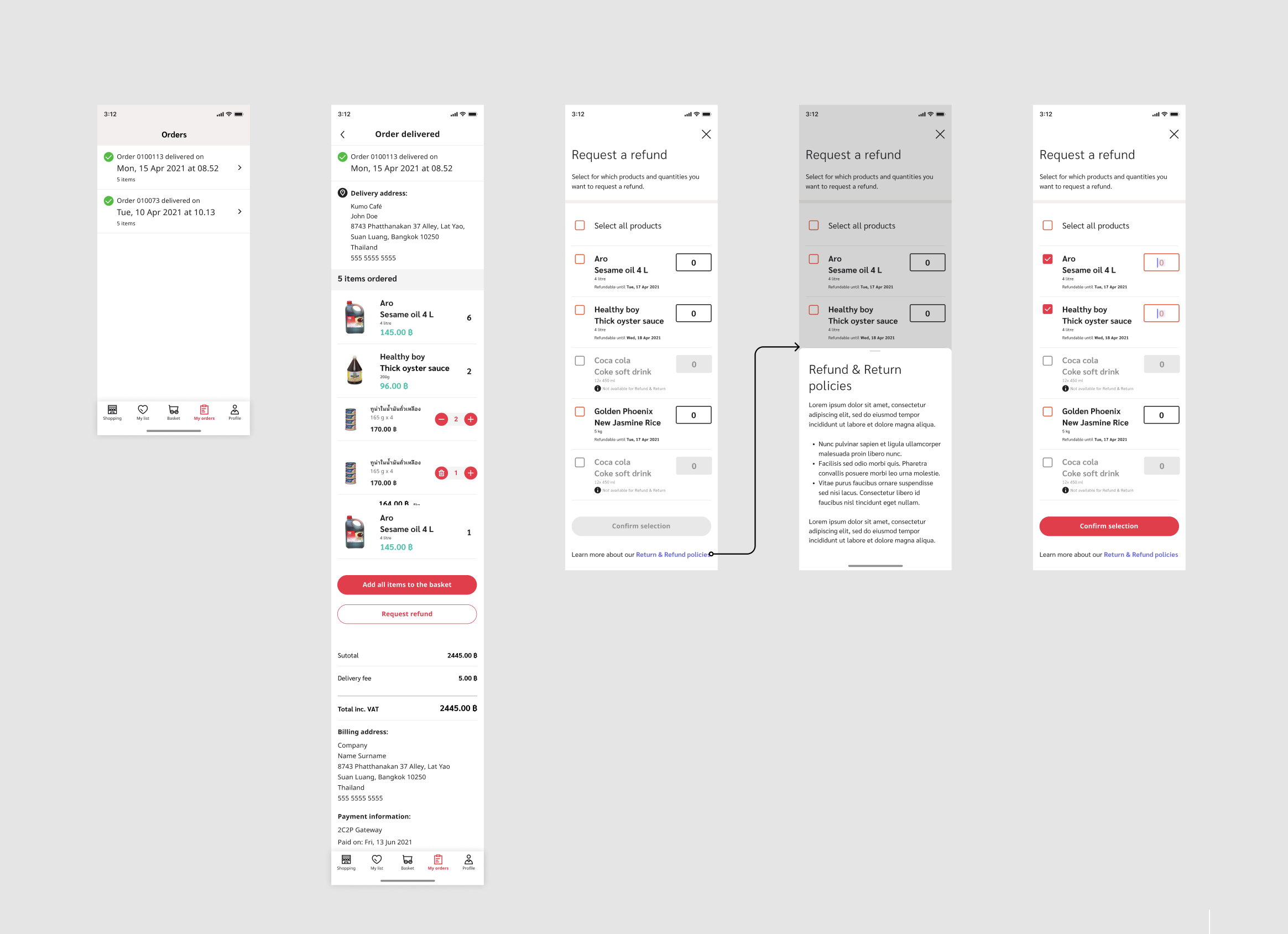
Designing the Refund process
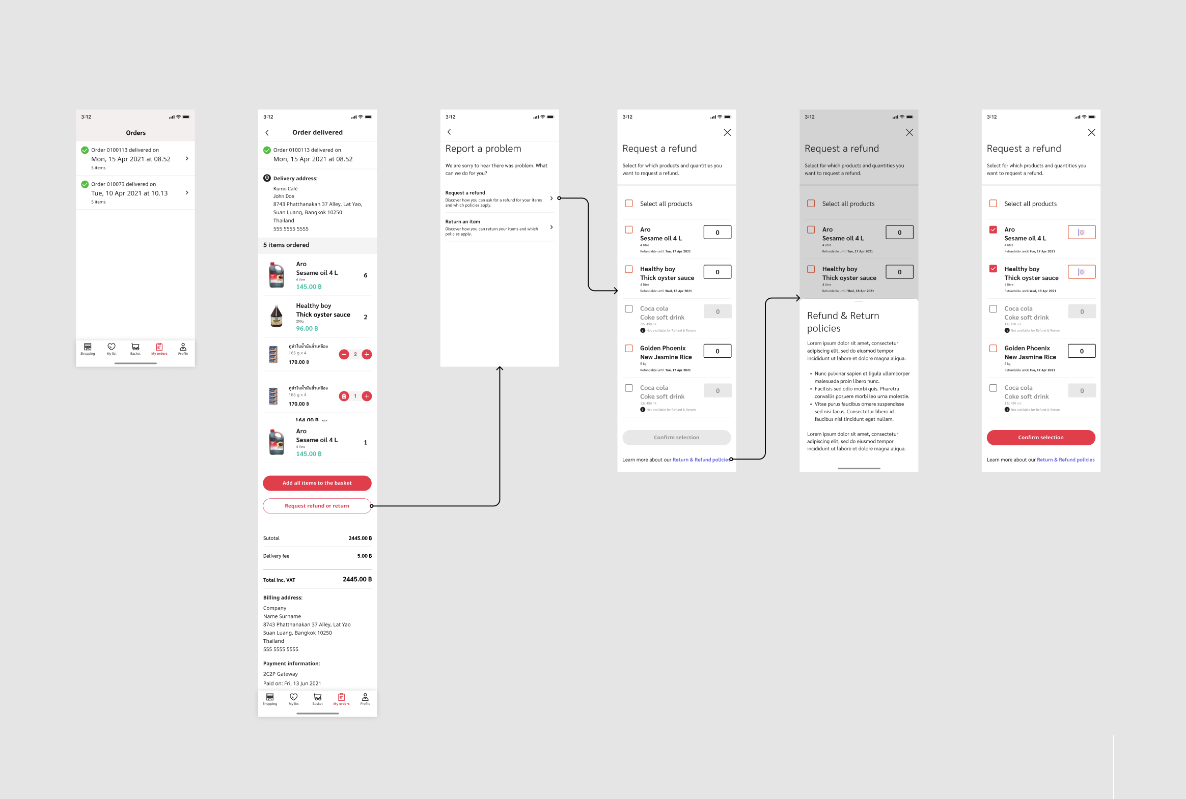
Before finalizing the refund process for a delivered order, users are required to fill out a form indicating the reasons for the refund (see below). This step is crucial as it allows us to collect valuable data on how to enhance our service.
1️⃣ Reporting a Problem
A clear call-to-action (“Request refund or return”) is placed within the order details. This directs users to a problem-reporting screen, where they can choose between requesting a refund or returning an item. The simplicity of options reduces confusion and speeds up decision-making.
2️⃣ Selecting Items for Refund
The next screen lists all products in the order with checkboxes and quantity selectors, allowing users to indicate exactly which items (and how many) they want refunded. To build trust, a link to Refund & Return policies is included at the bottom of the screen, offering transparency about the rules governing their request.
3️⃣ Policy Awareness
If needed, users can quickly access the policy details from within the flow. This ensures they understand the conditions before submitting, reducing potential frustration later if requests are denied.
4️⃣ Confirmation Step
Once items are selected, the “Confirm selection” button becomes active, moving users forward in the process. This progressive disclosure approach ensures users only see the next relevant step once required actions are completed.
Designing the Form
To design the refund request flow, I focused on creating a clear, step-by-step experience that minimized user effort while ensuring all necessary information was captured.
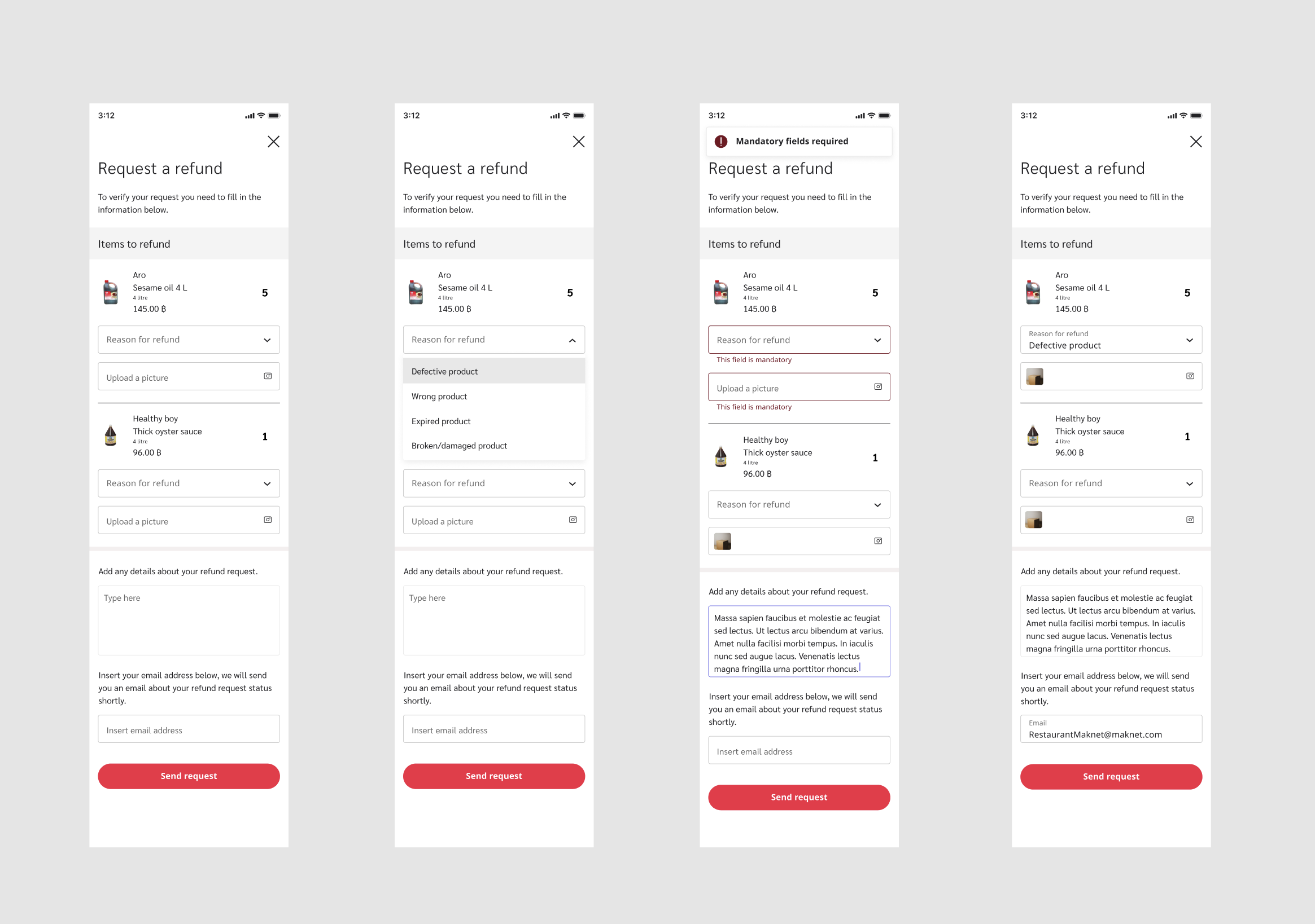
1️⃣ Initial Form Setup
Users start by reviewing the items eligible for refund. For each item, they can specify the reason for the refund, upload supporting evidence (e.g., a photo), and add additional details. This structure ensures clarity and allows flexibility for different refund scenarios.
2️⃣ Guided Input with Dropdowns
To reduce cognitive load, refund reasons are provided in a dropdown list (e.g., defective product, wrong product, expired product). This standardization prevents ambiguity and streamlines backend processing.
3️⃣ Error Handling and Validation
Mandatory fields are clearly marked. If a user attempts to submit without completing the required steps, inline error messages appear directly beneath the relevant fields, supported by a general alert at the top of the form. This prevents frustration by showing users exactly what needs correction.
4️⃣ Confirmation and Clarity
Users are prompted to provide their email address, ensuring they receive updates on their refund status. This builds trust and creates transparency in the process.
5️⃣ Accessibility and Usability
The design uses concise copy, logical grouping of fields, and clear calls-to-action ("Send request") to guide users through the process efficiently. Visual hierarchy and whitespace help reduce cognitive overload, while the use of consistent red highlights for actions and errors makes the interface intuitive.
Return
To streamline the return process, we utilized the same logic as the refund process. Since the reasons for requesting a refund or a return are often similar, adopting this approach allowed us to save development effort and expedite the design process.
3. User testing
We conducted interviews with 10 target users to test our mockups, supported by an agency that recruited potential Maknet users in Thailand. The process began by defining the research topics and questions we aimed to answer. I created a detailed interview script outlining primary and sub-research questions and prepared interactive prototypes in Figma for testing.
The agency scheduled Zoom interviews with the participants, and a translator assisted with any language barriers. By sharing my screen and providing access to the Figma prototypes, participants were able to interact directly with the designs while I guided them through the research questions, enabling us to gather actionable insights.
📝 Assumption
HORECA owners would want the ability to return goods and have them redelivered.
💡 Insight
HORECA owners actually prefer receiving a refund or a discount on their next purchase, rather than having the same goods returned.
“I need to know when I will be refunded as I need to fill in inventory and expenses every month at the end of the month”
“Refunds are much more convenient for me as a restaurant owner. I prefer getting my money back rather than going through the hassle of returning goods and waiting for replacements”
“I appreciate the flexibility of choosing a refund over returning goods. It gives me the freedom to make alternative arrangements and quickly replenish my inventory”
Prioritising key insights from the user test
After conducting the interviews, I compiled, organized, and analyzed the gathered insights. Using collaborative tools like Miro, we prioritized findings based on user value and technical effort. The results were then presented and discussed with the Product Owners (POs) to ensure alignment on which features should be developed.

What we learned
After discovering that our initial assumption about the return option was incorrect, we decided to remove it. This allowed us to streamline the refund experience, making it faster and more efficient for users. Additionally, simplifying the feature reduced development complexity, saving both time and resources.
4. Finalizing
Building on the insights from user interviews and the decisions made with Product Owners, I iterated on the MVP features and designed corresponding components in Figma. These components were integrated into the design system, which our team continuously maintained and updated to ensure consistency and scalability across the product.


Before you go check the Design Bites


