Rabobank Environmental Dashboard
INDUSTRY: Banking
PROJECT: B2B dashboard
Rabobank is one of the leading banks in the Netherlands and has set the ambition to become the bank of the green transition. To achieve this goal, Rabobank must focus on decarbonizing its indirect emissions, which requires a thorough review of the sustainability performance of its SME client portfolio.
ROLE: UX/UI Designer
TEAM: 1 designers, 4 developers, 1 PM, 2 POs, 4 sustainability consultants
DURATION: 4 months (MVP delivery)
SUMMARY: I designed a platform that connects Rabobank’s sustainability consultants with SME clients to support the bank’s ambition of driving the green transition. The platform consists of an online assessment that calculates each SME’s environmental footprint, an SME portal where clients can access and review their results, and a consultant portal where Rabobank advisors can track and manage outcomes. Following a Design Thinking approach, I conducted exploratory research to uncover needs and pain points, facilitated a stakeholder workshop to align on challenges, developed and iterated multiple design solutions, and validated them through user testing.
To inform SME about their sustainability performance and support them into decreasing CO2 emissions.
GOAL
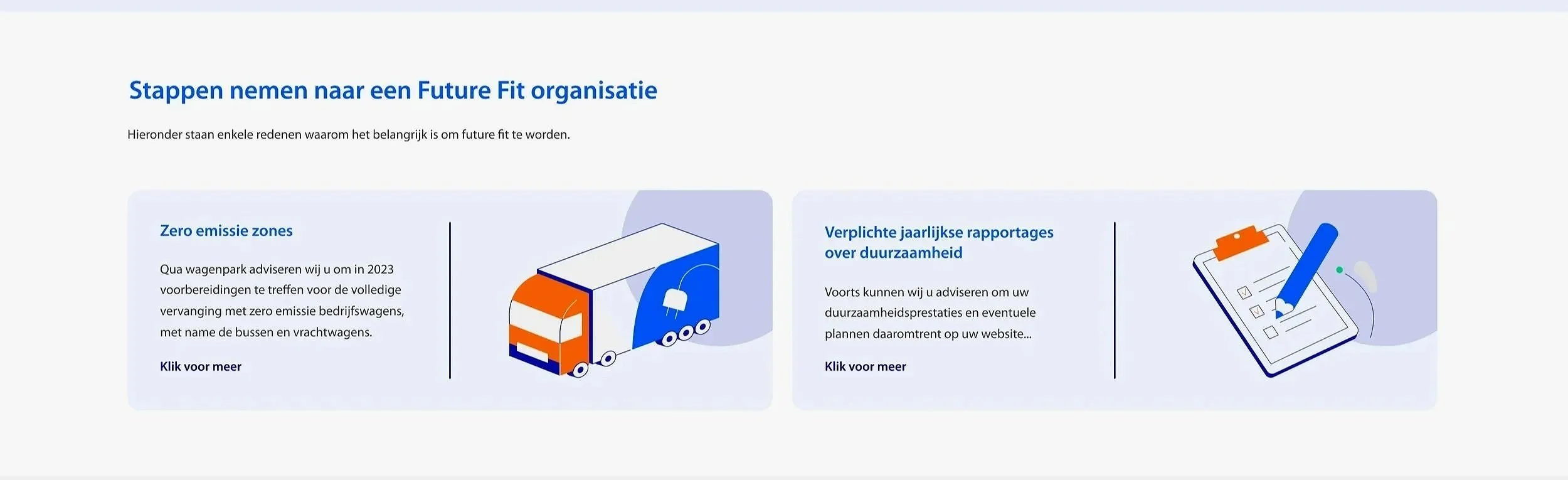
Aligned with the EU's climate targets, Rabobank has set ambitious goals to curtail carbon emissions. By 2030, the bank aims to achieve a significant 55% reduction in carbon emissions, while striving for complete carbon neutrality by 2050.
PROBLEM
The way Rabobank is collecting data is labour intensive and not user friendly.
Current process
Rabobank initiates contact by reaching out directly to SMEs. If an SME shows interest, they are directed to a landing page with more information. After this step, Rabobank consultants provide an Excel sheet filled with detailed questions about the SME’s business activities in order to assess their sustainability performance.
Pain points
This process was not user-friendly and created friction for SMEs. The reliance on a lengthy Excel file made data entry cumbersome, while the need for continuous consultant guidance placed a heavy burden on Rabobank’s internal resources.
Why change was needed
To scale its green transition strategy effectively, Rabobank required a solution that could streamline data collection, reduce dependency on consultants, and deliver a more accessible, engaging experience for SMEs.
PROCESS
The Design Thinking approach.
1.
Discovery
Organizing a workshop with relevant stakeholders to discover main issues in the process.
2.
Define
Identifying and prioritizing the main issues to work on first.
3.
Develop
Creating design proposals based on information collected during the workshop and following best practices.
4.
Delivery
FInalize the designs based on the users’ feedback.
1. Discovery phase
I tracked SME entire journey, starting from when the Rabobank consultants first reached out to them, all the way to when they receive their sustainability performance. After that, I organized a workshop and invited Rabobank’s consultants, project managers (PMs), and product owners (POs). The purpose of the workshop was to uncover problems in each stage of the journey and brainstorm snappy solutions that could be turned into features to test out.

2. Define phase
Problem
The phase where SMEs review their sustainability results is a make-or-break moment. After spending significant time completing detailed questions about their business activities, SMEs expect clear and actionable insights.
Why it matters
This stage determines whether clients remain engaged with the platform or abandon it entirely. Poorly presented results risk losing user trust and commitment.
Design focus
The goal was to create a results experience that is rewarding, trustworthy, and easy to understand, ensuring SMEs feel their effort is valuable and encouraging continued engagement with Rabobank’s sustainability program.
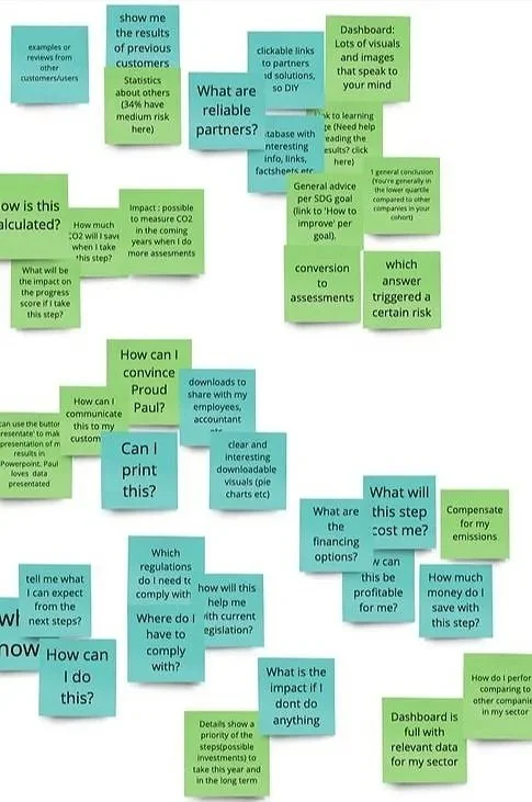

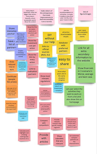
During the workshop, stakeholders identified a range of opportunities, which were then clustered and transformed into “How might we?” questions. These questions provided a foundation for generating ideas to address the design challenge of creating a compelling results experience for SMEs.
The ideas were further organized into seven macro groups:
1️⃣ Comparing with competitors – Provide context by showing how SMEs perform relative to peers.
2️⃣ Interactive graphs – Visualize data to make insights more engaging and digestible.
3️⃣ Interactive partners – Highlight sustainability partners or relevant collaborators for actionable connections.
4️⃣ Timeline & scenarios – Offer future projections or historical trends for better understanding of impact.
5️⃣ Regulations – Inform SMEs about relevant sustainability rules and compliance requirements.
6️⃣ Extra links & information – Provide supplementary resources for deeper exploration.
7️⃣ Quick actions & small adjustments – Suggest immediate steps SMEs can take to improve their sustainability performance.
3. Develop phase
I designed two distinct proposals for the results page, incorporating all the insights gathered during the workshop. Both designs were crafted with the specific needs of the target audience in mind. To inform these proposals, we created proto-personas based on data collected from conversations that Rabobank sustainability consultants had with SMEs, ensuring the solutions addressed real user behaviors, goals, and pain points.

Proud Paul, CEO
🔎 Overview: Proud of his company and personal achievements, Paul has limited time to dedicate to sustainability initiatives.
🧠 Behavior & motivation: He is reactively involved in sustainability, often responding to customer demands or regulatory requirements rather than proactively driving change.
🤕 Challenges & pain points: Paul feels overwhelmed by the complexity of sustainability and struggles to balance it with his other executive responsibilities.

Involved Ingrid, Sustainability Advisor
🔎 Overview: Ingrid is the first sustainability employee at Paul’s company and a strong advocate for sustainable practices.
🧠 Behavior & motivation: She is passionate about sustainability and skilled at linking sustainability initiatives to business outcomes.
🤕 Challenges & pain points: Ingrid is highly analytical and detail-oriented, which can make managing broader organizational engagement and communicating insights to non-specialists challenging.
Dashboard for Proud Paul
Dashboard for Involved Ingrid

USER TESTING
Testing two variants to measure best conversion.
To evaluate the effectiveness of the two design options, I conducted A/B user testing to identify which variant would drive higher conversion rates and better support SMEs in progressing to the next steps. Adopting a qualitative approach, I collected feedback from 16 end users to uncover insights into their preferences, behaviors, and decision-making patterns.
6 Sustainability consultant
Tested option 1
6 CEO
Tested option 2
2 Sustainability consultant
Tested option 2
2 CEO
Tested option 1
“There is too much text, I don’t have the time to read all of it, just give the highlights and the option to read more”
“What does this timeline indicate? I clicked on it but nothing happened”
“I don’t understand this pie chart, isn’t the goal to reach 55% sustainable energy by 2030? This pie chart seems to be saying we gotta go all the way to 100% sustainable”
“The colors used in the pie chart are misleading. I see blue and orange are used for different topics ”
RESULTS
Dashboard for Involved Ingrid emerged as the most effective alternative.
Analysis of the results revealed that Involved Ingrid dashboard was the most effective solution. Its success was measured by the number of SMEs indicating their willingness to schedule an appointment with a Rabobank sustainability consultant, reflecting a clear intent to move forward in the process.
Proud Paul Dashboard
🏁 Results
6 out of 16 users reported intent to move forward after testing this dashboard
Cons
🔴 Excessive text reduces scannability, making it harder for users to quickly grasp key information.
🔴 Design issues negatively affect the accurate interpretation of the chart.
🔴 The current color scheme may not support clarity and should be reevaluated.
🔴 Policies and regulations are perceived as less prominent compared to other interface elements.
Pros
🟢 Users can immediately see the impact of their actions on the 2030 goal, enhancing engagement.
🟢 Including a link to the supplier’s page facilitates access to additional, relevant information.
Involved Ingrid Dashboard
🏁 Results
10 out of 16 users reported intent to move forward after testing this dashboard
Cons
🔴 Design issues impede accurate interpretation of the chart.
🔴 Policies and regulations appear less prominent compared to other interface elements.
🔴 The functionality and interaction of the timeline are not immediately clear to users.
🔴 The color scheme should be reviewed and refined for better clarity and accessibility.
Pros
🟢 Concise text improves scannability, allowing users to more easily understand and process information.
🟢 Interactive pie charts increase engagement and offer richer, more comprehensive insights.
SECOND USER TESTING
New variant has the best conversion rate.
I incorporated all feedback to develop a new dashboard variant that combined insights from both Proud Paul and Involved Ingrid, aiming to enhance conversion. To validate its effectiveness, I conducted a comparative test against Involved Ingrid Dashboard, evaluating their respective conversion rates.
Involved Ingrid Dashboard
New Variant Dashboard

“I would like to see what is the ROI for each of these actions”
“I want to know more about the financial investment so I think I would like to schedule a call with a consultant”
“I really like this pie chart, it gives me a clear picture of the investment amount, the sustainability impact, and the timeline involved”
“Would it be possible to make a comparison with other suppliers to pick the best one? ”
Involved Ingrid Dashboard
🏁 Results
6 out of 16 users reported intent to move forward after testing this dashboard
Cons
🔴 Chart design issues make accurate interpretation difficult.
🔴 Policies and regulations appear less prominent compared to other interface elements.
🔴 Timeline functionality and interaction are unclear to users.
🔴 The color scheme should be reviewed and refined for improved clarity and accessibility.
Pros
🟢 Concise text improves scannability, helping users quickly understand and process information.
🟢 Interactive pie charts boost engagement and provide richer, more comprehensive insights.
New Variant Dashboard
🏁 Results
10 out of 16 users reported intent to move forward after testing this dashboard
Cons
🔴 Users cannot compare costs and benefits across multiple suppliers.
🔴 Investment rates are not displayed.
🔴 Additional financial details are needed to better support conversion.
Pros
🟢 The color scheme is clear and visually appealing.
🟢 Key information, such as the investment timeline and associated costs, is easily interpretable by users.
🟢 Positioning the call-to-action beneath financial information helps drive higher conversion rates.
4. Delivery phase
I synthesized end-user feedback to revise and merge the two designs into a unified solution. I then developed the design components and collaborated closely with developers, overseeing implementation to ensure fidelity to the intended user experience.
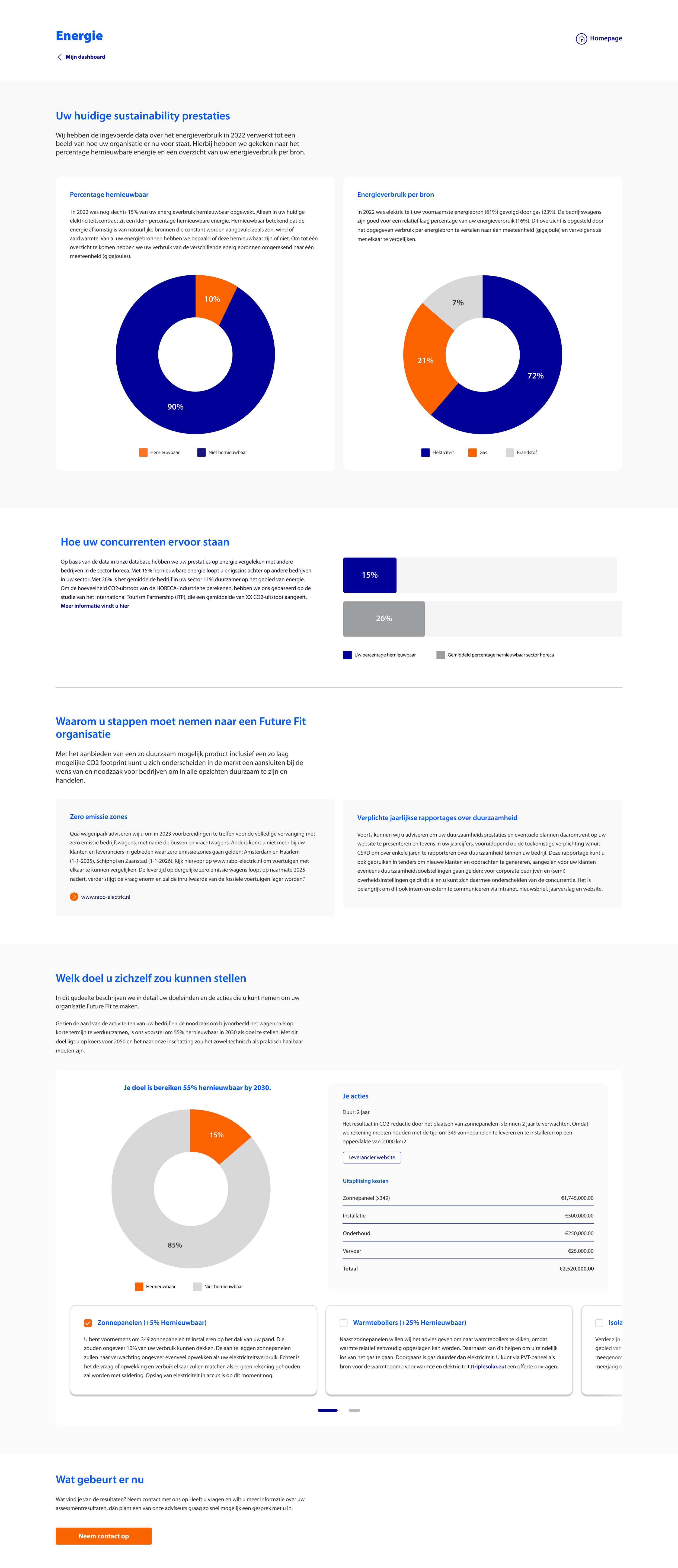
Current scenario
The graphs present the user's current sustainable performance, based on data collected from a questionnaire previously filled in.

Industry standards comparison
The users are able to compare their sustainability performance with the sustainability standards of the industry they belong to.

Future situation
This section highlights actionable steps to reduce the business's environmental impact and its impact on achieving the goal of a 55% CO2 reduction by 2030.

Policies and regulations
Here, the users can check which sustainability policies or regulations will have a direct impact or their business in the short and long term.
End of the funnel
At the end of the report, users can either contact a consultant or take another assessment.

Learnings
💡 Copy
Consultants often relied on excessive text, making the content difficult for users to digest. To address this, we implemented character limits and collaborated with the Product Owner to oversee copy quality. This approach significantly improved readability, resulting in more concise, user-friendly content.
💡 Product Roadmap
Integrating user needs into the product roadmap early in development is essential to prevent a feature-driven approach. I advocated for explicitly embedding user needs into the roadmap, clarifying how each feature addresses specific user goals. This alignment fostered a more user-centric and purposeful product development process.
Before you go check the Design Bites


